This site uses cookies to improve your experience. To help us insure we adhere to various privacy regulations, please select your country/region of residence. If you do not select a country, we will assume you are from the United States. Select your Cookie Settings or view our Privacy Policy and Terms of Use.
Cookie Settings
Cookies and similar technologies are used on this website for proper function of the website, for tracking performance analytics and for marketing purposes. We and some of our third-party providers may use cookie data for various purposes. Please review the cookie settings below and choose your preference.
Used for the proper function of the website
Used for monitoring website traffic and interactions
Cookie Settings
Cookies and similar technologies are used on this website for proper function of the website, for tracking performance analytics and for marketing purposes. We and some of our third-party providers may use cookie data for various purposes. Please review the cookie settings below and choose your preference.
Strictly Necessary: Used for the proper function of the website
Performance/Analytics: Used for monitoring website traffic and interactions
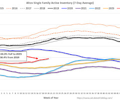
The first graph shows the seasonal pattern for active single-family inventory since 2015. If the previous week was the seasonal bottom, that would be very early in the year, but that has happened before. Click on graph for larger image. The red line is for 2024. The black line is for 2019. Inventory was up 24.8%
The first graph shows the seasonal pattern for active single-family inventory since 2015. Usually, inventory is up about 5% or 6% from the seasonal low by this week in the year. So, 2025 is seeing a larger than normal pickup in inventory. Click on graph for larger image. The red line is for 2025. The black line is for 2019.
The first graph shows the seasonal pattern for active single-family inventory since 2015. Inventory always declines seasonally in the Winter and usually bottoms in January or February. Inventory is now up 2.5% from the bottom six weeks ago in January. Click on graph for larger image. The red line is for 2025. The black line is for 2019.
The first graph shows the seasonal pattern for active single-family inventory since 2015. Usually, inventory is up about 4% or 5% from the seasonal low by this week in the year. So, 2025 is seeing a larger than normal pickup in inventory. Click on graph for larger image. The red line is for 2025. The black line is for 2019.
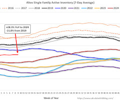
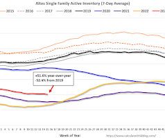
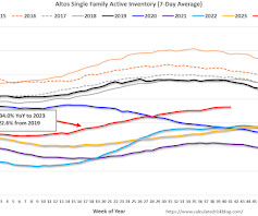
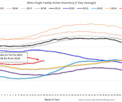
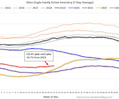
The first graph shows the seasonal pattern for active single-family inventory since 2015. Inventory is now up 5.0% from the seasonal bottom nine weeks ago in January and us starting to increase seasonally. Click on graph for larger image. The red line is for 2025. The black line is for 2019. Inventory was up 29.3%
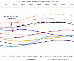
The first graph shows the seasonal pattern for active single-family inventory since 2015. Inventory is now up 2.9% from the seasonal bottom eight weeks ago in January and should start increasing significantly in the Spring. Click on graph for larger image. The red line is for 2025. The black line is for 2019. Inventory was up 28.3%
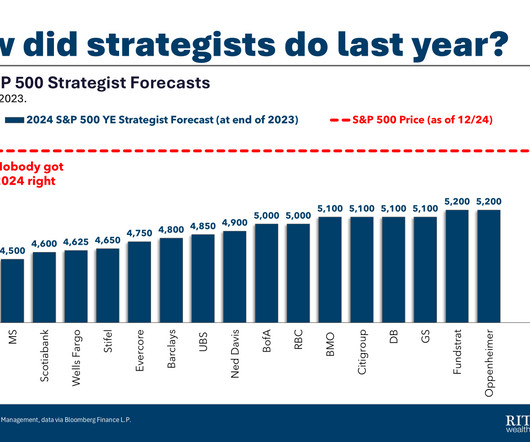
Source : S&P 500s 2024 Rally Shocked Forecasters Expecting It to Fizzle By Alexandra Semenova and Sagarika Jaisinghani Bloomberg, December 29, 2024 See also : My Year-End Stock Market Forecast (December 10, 2024) All those 2025 mortgage rates forecasts are now wrong By Mike Simonsen Housing Wire, December 19, 2024 Previously : Coming March 18: (..)
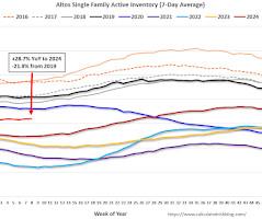
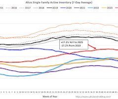
The first graph shows the seasonal pattern for active single-family inventory since 2015. Inventory is now up 2.4% from the seasonal bottom seven weeks ago in January and should start increasing seasonally in March. Click on graph for larger image. The red line is for 2025. The black line is for 2019. Inventory was up 28.3%
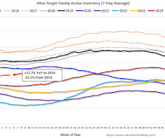
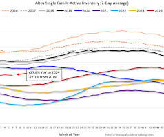
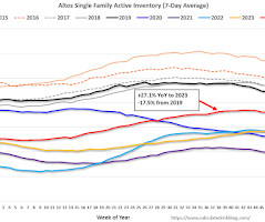
The first graph shows the seasonal pattern for active single-family inventory since 2015. If three weeks ago was the seasonal bottom, that would be very early in the year, but that has happened before. Click on graph for larger image. The red line is for 2024. The black line is for 2019. Inventory was up 27.7%
The second graph shows the seasonal pattern for active single-family inventory since 2015. As of January 6th, inventory was at 471 thousand (7-day average), compared to 491 thousand the prior week. Inventory has declined sharply seasonally in the winter. The red Dot is for the first week of 2023. The black line is for 2019.
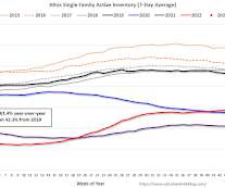
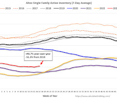
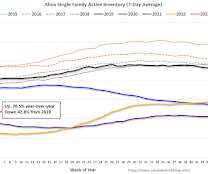
The second graph shows the seasonal pattern for active single-family inventory since 2015. This is the highest level of inventory since June 2020 ; however, inventory is still well below pre-pandemic levels. The red line is for 2024. The black line is for 2019. Inventory was up 40.4%
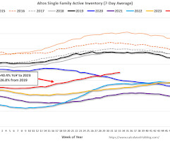
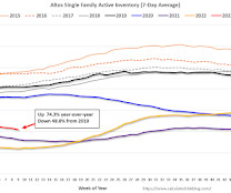
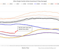
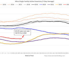
The first graph shows the seasonal pattern for active single-family inventory since 2015. Altos reports that active single-family inventory was up 1.0% week-over-week. Inventory is now up 49.7% from the February seasonal bottom. Click on graph for larger image. The red line is for 2024. The black line is for 2019. Inventory was up 33.4%
The second graph shows the seasonal pattern for active single-family inventory since 2015. As of April 14th, inventory was at 405 thousand (7-day average), compared to 411 thousand the prior week. Year-to-date, inventory is down 17.4%. The red line is for 2023. The black line is for 2019.
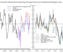
The right graph is from 2015 to Q4 2024. This graph on Residential Real Estate demand is from the Senior Loan Officer Survey Charts. This graph is for demand and shows that demand has been weak since late 2021. The left graph is from 1990 to 2014.
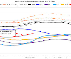
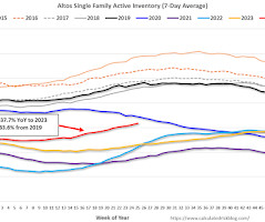
The second graph shows the seasonal pattern for active single-family inventory since 2015. As of June 7th, inventory was at 612 thousand (7-day average), compared to 605 thousand the prior week. Inventory is still far below pre-pandemic levels. The red line is for 2024. The black line is for 2019. Inventory was up 37.8%
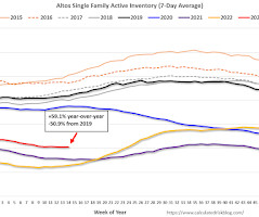
The second graph shows the seasonal pattern for active single-family inventory since 2015. This is the highest level of inventory since June 2020 ; however, inventory is still far below pre-pandemic levels. The red line is for 2024. The black line is for 2019. Inventory was up 39.9%
The second graph shows the seasonal pattern for active single-family inventory since 2015. Year-to-date, inventory is down 9.7%. And inventory is up 9.3% from the seasonal bottom eight weeks ago. The red line is for 2023. The black line is for 2019.
If you were in Congress from 2015-2021, you are the reason why HALF of the projected federal debt will soon be interest payments. Source: Chartr We talked about this 2 weeks ago , but the nation missed a fantastic opportunity to refinance all of the outstanding US debt at much lower levels.
The second graph shows the seasonal pattern for active single-family inventory since 2015. As of April 26th, inventory was at 556 thousand (7-day average), compared to 543 thousand the prior week. Inventory is still far below pre-pandemic levels. The red line is for 2024. The black line is for 2019.
The second graph shows the seasonal pattern for active single-family inventory since 2015. Year-to-date, inventory is down 14.3%. And inventory is up 3.7% from the seasonal bottom four weeks ago. The red line is for 2023. The black line is for 2019.
The second graph shows the seasonal pattern for active single-family inventory since 2015. As of May 10th, inventory was at 568 thousand (7-day average), compared to 560 thousand the prior week. Inventory is still far below pre-pandemic levels. The red line is for 2024. The black line is for 2019. Inventory was up 35.0%
The first graph shows the seasonal pattern for active single-family inventory since 2015. Inventory is now up 1.3% from the bottom four weeks ago. Inventory has been little changed over the last 4 weeks. Click on graph for larger image. The red line is for 2024. The black line is for 2019. Inventory was up 27.8%
The second graph shows the seasonal pattern for active single-family inventory since 2015. As of May 17th, inventory was at 578 thousand (7-day average), compared to 568 thousand the prior week. Inventory is still far below pre-pandemic levels. The red line is for 2024. The black line is for 2019. Inventory was up 36.0%
The second graph shows the seasonal pattern for active single-family inventory since 2015. Year-to-date, inventory is down 14.0%. And inventory is up 4.1% from the bottom two weeks ago. The red line is for 2023. The black line is for 2019.
The second graph shows the seasonal pattern for active single-family inventory since 2015. As of April 7th, inventory was at 411 thousand (7-day average), compared to 410 thousand the prior week. Year-to-date, inventory is down 16.3%. The red line is for 2023. The black line is for 2019.
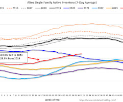
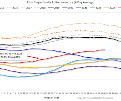
The second graph shows the seasonal pattern for active single-family inventory since 2015. As of September 27th, inventory was at 731 thousand (7-day average), compared to 725 thousand the prior week. This is the highest level of inventory since May 2020. The red line is for 2024. The black line is for 2019. Inventory was up 36.7%
The second graph shows the seasonal pattern for active single-family inventory since 2015. Year-to-date, inventory is down 5.1%. And inventory is up 14.9% from the seasonal bottom eleven weeks ago. The red line is for 2023. The black line is for 2019.
The second graph shows the seasonal pattern for active single-family inventory since 2015. As of December 30th, inventory was at 491 thousand (7-day average), compared to 508 thousand the prior week. Inventory has declined sharply over the holidays. The red line is for 2022. The black line is for 2019.
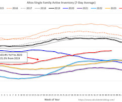
The first graph shows the seasonal pattern for active single-family inventory since 2015. Altos reports that active single-family inventory was down 0.3% week-over-week. Inventory is now up 48.3% from the February seasonal bottom. Click on graph for larger image. The red line is for 2024. The black line is for 2019. Inventory was up 34.0%
The Barclays breakaway discusses his 2015 landmark leap with five partners, three offices, and $3 billion in AUM, plus shares why he feels UHNW clients are best served in independence, what they do to drive extraordinary growth, and much more.
The first graph shows the seasonal pattern for active single-family inventory since 2015. Inventory is now 2.8% below the peak for the year (5 weeks ago). Inventory will now decline seasonally until early next year. Click on graph for larger image. The red line is for 2024. The black line is for 2019. Inventory was up 27.1%
The second graph shows the seasonal pattern for active single-family inventory since 2015. As of January 13th, inventory was at 473 thousand (7-day average), compared to 471 thousand the prior week. The red line is for 2023. The black line is for 2019.
The second graph shows the seasonal pattern for active single-family inventory since 2015. As of March 3rd, inventory was at 419 thousand (7-day average), compared to 430 thousand the prior week. The red line is for 2023. The black line is for 2019.
The second graph shows the seasonal pattern for active single-family inventory since 2015. As of June 21st, inventory was at 634 thousand (7-day average), compared to 621 thousand the prior week. Inventory is still far below pre-pandemic levels. The red line is for 2024. The black line is for 2019. Inventory was up 37.7%
The first graph shows the seasonal pattern for active single-family inventory since 2015. Altos reports that active single-family inventory was up 0.4% week-over-week. Inventory is now up 48.6% from the February seasonal bottom. Click on graph for larger image. The red line is for 2024. The black line is for 2019. Inventory was up 36.7%
The second graph shows the seasonal pattern for active single-family inventory since 2015. As of January 27th, inventory was at 466 thousand (7-day average), compared to 472 thousand the prior week. The red line is for 2023. The black line is for 2019.
The second graph shows the seasonal pattern for active single-family inventory since 2015. As of January 20th, inventory was at 472 thousand (7-day average), compared to 473 thousand the prior week. The red line is for 2023. The black line is for 2019.
The second graph shows the seasonal pattern for active single-family inventory since 2015. As of May 3rd, inventory was at 560 thousand (7-day average), compared to 556 thousand the prior week. Inventory is still far below pre-pandemic levels. The red line is for 2024. The black line is for 2019. Inventory was up 33.1%
The second graph shows the seasonal pattern for active single-family inventory since 2015. As of March 31st, inventory was at 410 thousand (7-day average), compared to 413 thousand the prior week. Year-to-date, inventory is down 16.5%, and at the lowest point so far this year. The red line is for 2023. The black line is for 2019.
The second graph shows the seasonal pattern for active single-family inventory since 2015. Year-to-date, inventory is down 11.1%. And inventory is up 7.6% from the seasonal bottom seven weeks ago. The red line is for 2023. The black line is for 2019.
The second graph shows the seasonal pattern for active single-family inventory since 2015. As of April 21st, inventory was at 414 thousand (7-day average), compared to 405 thousand the prior week. Year-to-date, inventory is down 15.6%. The red line is for 2023. The black line is for 2019.
The first graph shows the seasonal pattern for active single-family inventory since 2015. Inventory is now 4.4% below the peak for the year (6 weeks ago). Inventory will now decline seasonally until early next year. Click on graph for larger image. The red line is for 2024. The black line is for 2019. Inventory was up 27.1%
147
147
Input your email to sign up, or if you already have an account, log in here!
Enter your email address to reset your password. A temporary password will be e‑mailed to you.
We organize all of the trending information in your field so you don't have to. Join 36,000+ users and stay up to date on the latest articles your peers are reading.
You know about us, now we want to get to know you!
Let's personalize your content
Let's get even more personalized
We recognize your account from another site in our network, please click 'Send Email' below to continue with verifying your account and setting a password.


Let's personalize your content